Recently I got inspired by a background image on a commercial website, which I tried to recreate with purely CSS. It was just two layers of stripes in black and grey, with a slight difference in their angle of rotation.

Their designers created 2 versions of animated GIFs. One for desktop devices, another for mobile devices with smaller screen sizes.
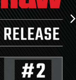
Generally speaking, it is a bad idea to use static images for dynamically resized content on a web page. Even more when there is text in the image. If scaled below 100% image still look acceptable in most cases but why would you use an image twice as big, quadrupling the amount of transferred bytes. But whats worse in this design is the fact that upscaling leads to uncontrollable blurry images and washed-out graphics.
Never put design elements in a static image, place that on the most prominent part of the landing page and use a style rule like background-size:cover;. It even doesn’t save you any money. It is always better to let the browser render fonts.
Anyways, I wanted to experiment with CSS to try if even the background image is reproducible in pure CSS. I hacked together a quick prototype, here is the fiddle. Check out some screenshots of the results.


The second example uses em as unit, so it looks good on different screen sizes.

I used two sets of parallel lines in different angles. The lines are placed by the CSS rule repeating-linear-gradient() (see MDN). Here is some information about the underlying calculations. It turned out to be a little work to get the angles appealing. I also added an inset box shadow effect.
Of course it doesn’t look the same, but with some trial and error it can get close enough.